How to increase your Shopify conversion rate: 15 fixes, in the order we check them
Start with your numbers, then walk your store like a shopper: homepage, product page, cart and checkout. Here's what we look for at each step.

By Nicolas Fradet, founder of FunnelSpark · 16 years in CRO, 1,000+ A/B tests
Updated Nov 2, 2026 · 9 min read
The short answer
To increase your Shopify conversion rate, don't start with a redesign. Check your numbers, find the step where most shoppers drop, then fix that step: a clear first screen, easy search, product pages that answer questions, no surprise costs in the cart and a fast checkout. Below are 15 fixes, in the order we check them.
What's a good Shopify conversion rate?
Your conversion rate is the share of visits that end in an order. 100 visits and 2 orders is a 2% conversion rate.
In Littledata's benchmark of 436 Shopify stores, the median store converts 1.4% of sessions. The top 20% convert above 2.7%, and the top 10% above 3.7%. So at 1%, there's a lot of room to grow. At 3%, you're doing well, and the next gains come from smaller, tested changes. Our ecommerce conversion rate benchmarks break it down by industry and device.
One warning: a big discount can raise your conversion rate and still lose you money. That's why we judge every change by revenue per visitor, which counts both your conversion rate and your average order value.
The order we check a store
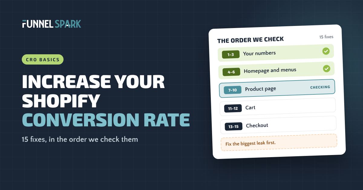
When we look at a store for the first time, we start with the numbers, not the design. Then we walk the store the way a shopper does: homepage, product page, cart, checkout.
There's no point polishing the product page if your tracking is broken, or if most shoppers leave on the homepage. The 15 fixes below follow that route. It isn't a ranking of which fix wins most often, because every store leaks in a different place. It's the path that finds the biggest leak before you spend time on small ones.
The 15 fixes, in the order we check them
- 1Tracking you can trust
- 2The right traffic
- 3Your biggest drop
- 4A clear first screen
- 5An easy first click
- 6Easy to find products
- 7Works on a phone
- 8Clear photos
- 9Answers by the button
- 10Reviews
- 11No surprise costs
- 12Reassurance
- 13Express checkout
- 14No forced accounts
- 15Win-back emails
Fixes 1 to 3: check your numbers first
1. Make sure you can trust your numbers
Place a test order and make sure it shows up in Shopify and in the other tools you use, like Google Analytics and your ad platforms. Look for strange days: zero sessions, a sudden spike, orders that never got tracked. If the numbers are wrong, every decision after this one is a guess.
2. Check you're getting the right traffic
A low conversion rate is sometimes a traffic problem, not a store problem. In Shopify Analytics, compare conversion rate by source and look at where visitors are located. Warning signs: one source sends lots of visits but almost no add to carts, visits from countries you don't ship to, or a viral post that brought people who were entertained, not shopping. If one ad campaign's visitors never buy, fix the campaign, not the store.
3. Find your biggest drop
Shopify's Conversion rate breakdown report shows 4 steps: all sessions, sessions with cart additions, sessions that reached checkout and sessions that completed checkout. Find the step where you lose the most people over the last 30 days, then watch 15 to 20 session recordings of shoppers at that step (Microsoft Clarity is free). That drop tells you which fixes below to start with. Our guide to getting traffic but no sales walks through it step by step.
Fixes 4 to 6: homepage and menus
4. Say what you sell on the first screen
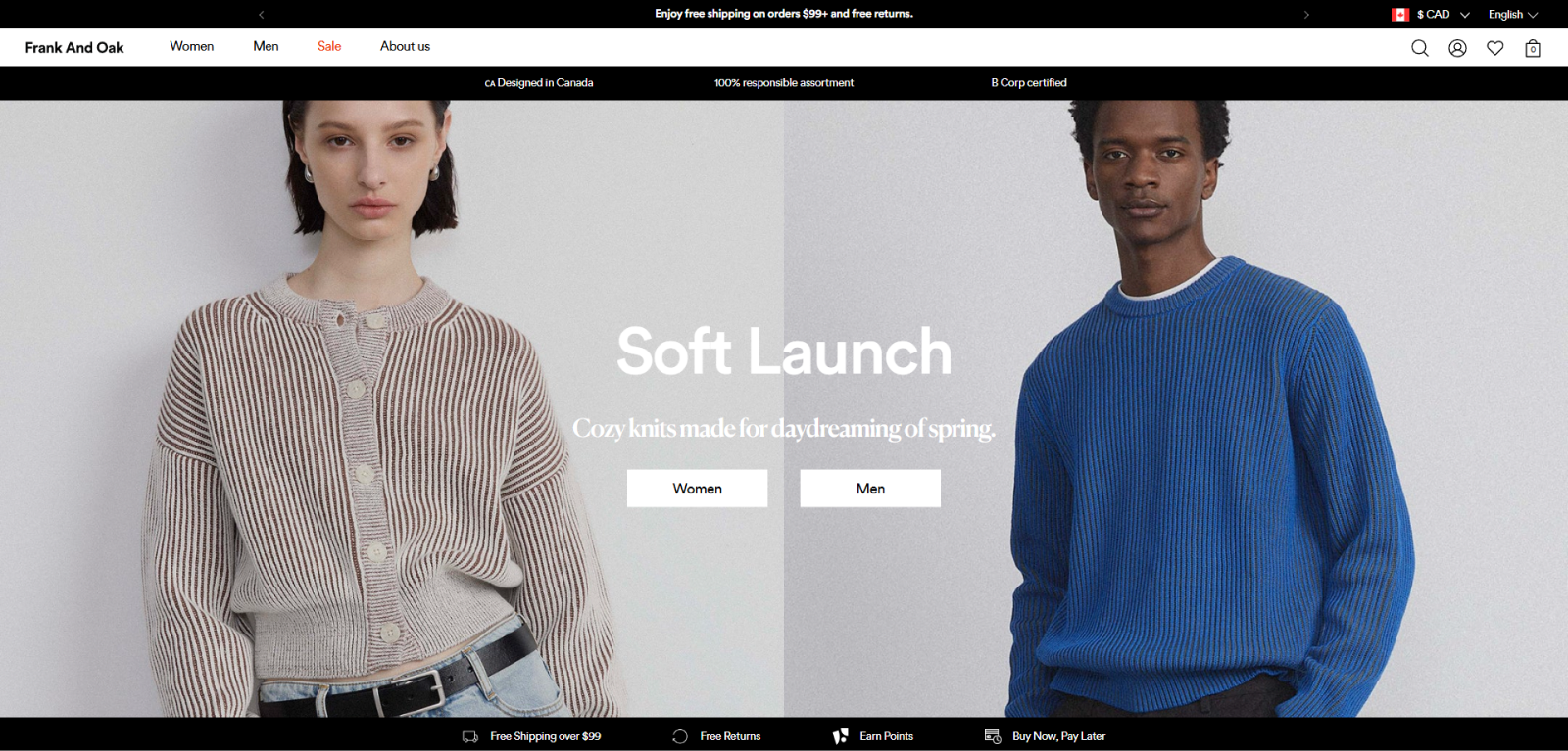
Visitors decide in a few seconds if they're in the right place, and a lifestyle photo with a clever slogan doesn't tell them. Say what you sell and who it's for, in plain words, and show your main reasons to buy, like free shipping or free returns. 18 of the 25 top stores we broke down use an announcement bar or a bar of selling points to do exactly that.
5. Give shoppers an easy first click
Help people sort themselves right away, with photo tiles or buttons like "Shop women" and "Shop men", or by need, like "For dogs" and "For cats". 20 of the 25 top stores we broke down use tiles or buttons like these on the homepage.
6. Make products easy to find
Name menu items the way shoppers talk, put your best collections in the main menu and make search easy to spot on mobile. On collection pages, let people filter and sort by size, price or use: 21 of the 25 top stores we broke down do.
Fixes 7 to 10: the product page
This is where most stores have the most to gain. Our product page optimization guide goes deeper. Here's what we check first.
7. Buy from your own store on your phone
Most store owners check their store on a laptop. Look at sessions by device in Shopify Analytics to see how many of your shoppers use a phone. Then take yours and buy something, starting on the homepage. Write down every moment you wait for a page, hunt for a button or close a pop-up. Slow pages, pop-ups that cover the add to cart button and tiny tap targets are leaks you can find in 5 minutes.
8. Show the product clearly
Shoppers can't touch the product, so photos do the selling. Show several angles, show its size (on a person, in a hand, in a room) and keep the main photos clean. 21 of the 25 top stores we broke down use a plain background for their product photos.
9. Answer the big questions next to the button
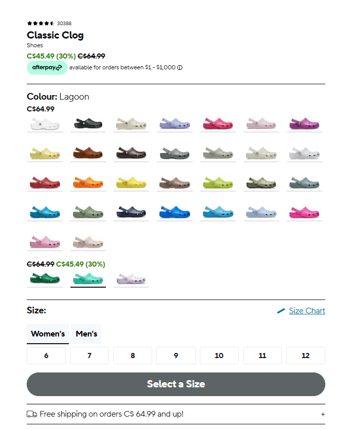
Every unanswered question is a reason to leave. Will it fit? What does shipping cost? Can I return it? Put the answers near the add to cart button: a size guide if size matters, your shipping cost or free shipping line, and your returns promise. 12 of the 25 top stores we broke down show a guarantee or returns promise, and 9 show shipping or delivery details before checkout. And make add to cart the strongest button on the page. Only 3 of the 25 use a sticky one that follows you as you scroll, so test that idea rather than copy it.
10. Show reviews where people decide
Nobody wants to be the first customer. 23 of the 25 top stores we broke down show ratings and reviews on the product page. Put the star rating near the product name, where shoppers see it before they scroll. No reviews yet? Email your first buyers and ask.
Fixes 11 and 12: the cart
11. No surprise costs
This is the big one. In Baymard Institute's checkout research, 40% of shoppers who abandoned an order said extra costs like shipping, taxes and fees were the reason, the top reason on their list. Show shipping costs before checkout, on the product page and in the cart. If you offer free shipping above an amount, say so, and show shoppers how close they are. Here's how to set your free shipping threshold without hurting your margins.
top stores we broke down show a free shipping threshold or confirm free shipping in the cart or checkout. Source: FunnelSpark breakdown of 25 top stores, page by page.
12. Reassure people right before they commit
The cart is where doubts come back. Repeat your returns and shipping promises next to the checkout button. In Baymard's research, 19% of shoppers who abandoned didn't trust the site with their card details, and 13% weren't happy with the returns policy. 19 of the 25 top stores we broke down mention security somewhere in their funnel, most of them at checkout (here's whether trust badges work). More cart fixes in our guide on how to reduce cart abandonment.
Fixes 13 to 15: checkout
Shopify's checkout is already quick, and one-page checkout is the default, so most checkout fixes are settings. Adding custom text inside the checkout steps, like a guarantee next to the pay button, needs Shopify Plus. Our Shopify checkout guide covers what you can change on each plan.
13. Turn on express checkout
Shop Pay, Apple Pay, Google Pay and PayPal let returning shoppers pay without typing their card and address. Shopify can also show these buttons on the product page, so shoppers skip the cart. 24 of the 25 top stores we broke down offer several ways to pay. In Baymard's research, 9% of shoppers who abandoned said there weren't enough payment methods.
14. Don't make people create an account
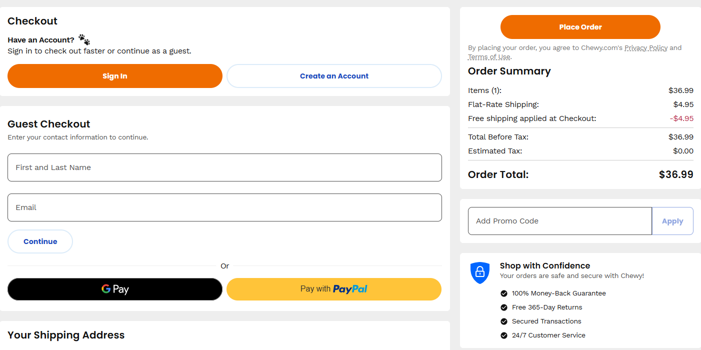
In Baymard's research, 18% of shoppers who abandoned an order left because the site wanted them to create an account, and 17% because checkout was too long or complicated. Check your Shopify settings and make sure shoppers can pay without signing in. Offer the account after the order, not before it.
15. Win back the ones who leave
Some shoppers will always leave. Shopify counts a checkout as abandoned once it's been left unfinished for more than 10 minutes after the shopper gave an email address, and it can send an abandoned checkout email automatically, with a link to finish the order. Turn it on, and make the email helpful: show what they left, answer the shipping and returns questions, and make finishing one click away.
What should you fix first?
Start with the step where you lose the most shoppers (fix 3). Within it, start with fixes that remove a worry: a hidden cost, an unanswered question, a forced account. They're cheap, quick and rarely backfire.
- Fix obvious leaks without testing. A hidden shipping cost or a broken mobile menu doesn't need an A/B test. Our ecommerce CRO checklist lists 40 leaks like these. Skip the full redesign, though: it changes 50 things at once.
- Test the rest. Of the 1,000+ A/B tests we've run, 37% beat the original. The industry average is about 15%. So even ideas that look great often don't lift sales.
- Check your traffic before you test. Proving a 10% lift at a 2% conversion rate takes about 161,000 visitors. With less traffic, lean on user tests, customer feedback and faster signals like add to cart rate. Our guide to ecommerce A/B testing explains how.
Store owners usually want to start with the page they like least. We start with the numbers. They tell us which page to look at, and the page tells us what to fix.
Want to see what a higher conversion rate is worth? Our revenue calculator does the math. Rather have someone walk your store for you? FunnelSpark, an ecommerce CRO agency for Shopify stores, does that in the P.R.O.F.I.T. Audit, a page-by-page video review of your store.
FAQ
Start with the leaks that don't need a test: show shipping costs early, turn on express checkout, don't force shoppers to create an account, and put shipping and returns details next to the add to cart button. Then find your biggest drop in Shopify's Conversion rate breakdown report and work on that step.
In Littledata's benchmark of 436 Shopify stores, the median store converts 1.4% of sessions, the top 20% convert above 2.7% and the top 10% above 3.7%. Compare your store to itself over time and by traffic source, not only to an average.
Usually for one of 3 reasons: the wrong traffic, a store that doesn't answer shoppers' questions or earn their trust, or friction in the cart and checkout, like surprise shipping costs. Shopify's Conversion rate breakdown report shows which step loses the most people.
No. Express checkout, payment methods, shipping rates and abandoned checkout emails don't need Plus. You need Shopify Plus to add custom text or content inside the checkout steps, like a guarantee next to the pay button.
Usually not. A redesign changes many things at once, so you can't tell what helped and what hurt. Fix your biggest leak first, then test changes one at a time once you have enough traffic.
Written by
Nicolas Fradet
Nicolas is the founder of FunnelSpark, an ecommerce CRO agency. He has spent 16 years finding out why shoppers don't buy, with 1,000+ A/B tests run and a 37% win rate. He wrote Stop Guessing. Start Converting.
Follow Nicolas on LinkedIn →Want us to find what's stopping your shoppers?
On a free 30-minute call, Nicolas looks at your store and shows you 3 growth opportunities, whether we work together or not.
Book your free call