Do trust badges work? What top stores and A/B tests show
Which badges help, which ones get ignored, and where to put them so shoppers actually feel safe buying.

By Nicolas Fradet, founder of FunnelSpark · 16 years in CRO, 1,000+ A/B tests
Updated Oct 31, 2026 · 8 min read
The short answer
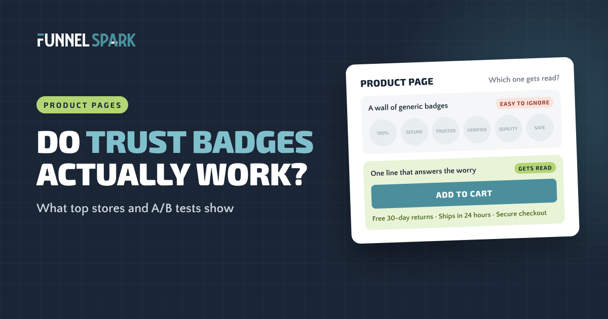
Trust badges work when they answer a specific worry at the moment the shopper has it. A padlock and card logos next to the checkout button calm "is my card safe?" A returns promise under the add to cart button calms "what if it doesn't fit?" A wall of generic "100% Secure" and "Quality Guaranteed" shields usually does little. Pick the 2 or 3 worries your buyers really have, answer each one in plain words, and put the answer right next to the button.
What counts as a trust badge?
A trust badge is any small icon, logo or line of text that tells a shopper "you're safe buying here." The common types are:
- Security badges: a padlock, "Secure checkout," or a seal from a security company like Norton or McAfee.
- Payment icons: the Visa, Mastercard, Amex, PayPal and Apple Pay logos.
- Guarantee badges: "30-day money-back guarantee" or "Free returns."
- Certification badges: third-party testing, organic, cruelty-free, made in a certified facility.
- Review badges: star ratings, review counts, or a logo from a review platform.
Don't mix these up with product badges like "New," "Sale" or "Bestseller." Those help shoppers pick a product. They don't make anyone feel safer handing over a card number.
Do trust badges work? What the research says
The worry they fix is real. In Baymard Institute's checkout research, 19% of US online shoppers said they had abandoned a checkout in the last 3 months because they didn't trust the site with their card details.
But Baymard also found that shoppers judge security by gut feel, not by how secure a site really is. In its seal study, a plain homemade "secure" seal did better than most of the big-name SSL seals. So having a clear cue matters far more than which company made it.
Placement matters too. Baymard's advice is to visually box in the card fields and put 1 or 2 seals or a padlock inside that box, right where the shopper types their card number.
Baymard also notes that lesser-known stores need more of these cues than big brands, because shoppers start out unsure.
What 25 top stores actually show
We broke down 25 top ecommerce stores page by page, from the homepage to the checkout. Here's what they do with trust:
- Only 8 of 25 show trust-type badges or logos, like card logos, certifications or a lock icon. Badge walls are rare.
- 19 of 25 mention a secure checkout in some way, mostly at the checkout itself.
- 12 of 25 show a guarantee or returns promise.
- 23 of 25 show ratings and reviews on the product page. That's the most common trust signal of all.
19 of the 25 do use badges, but they're product badges like "New" and "Bestseller." When the top stores want to build trust, they mostly use short lines of text and reviews, placed right where the worry shows up.
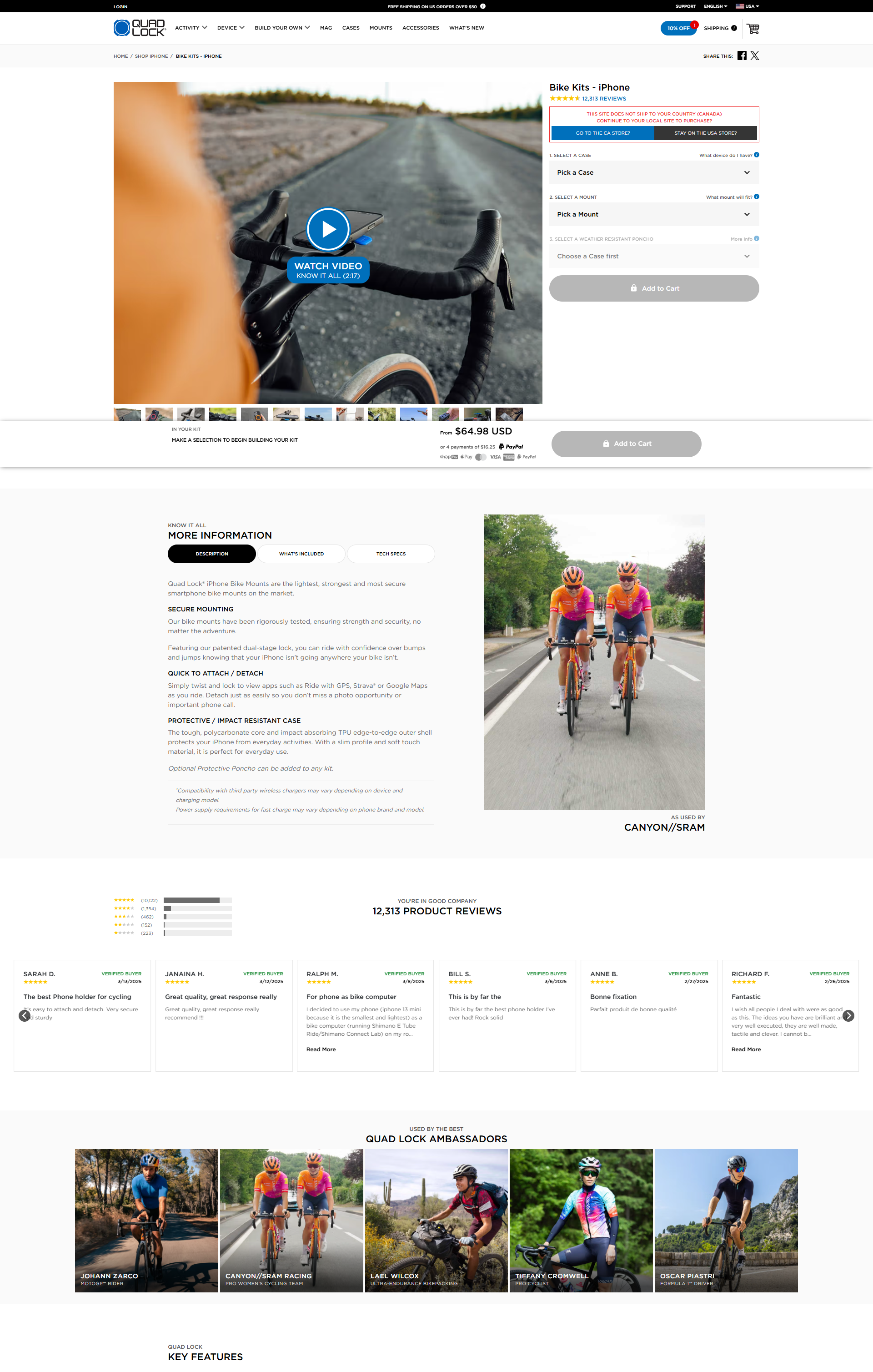
Quad Lock, the phone mount brand, is a good example. Instead of a row of shields under the button, it puts a small padlock right on the Add to Cart button itself.
Which badge answers which worry
Start with the worry, not the badge. Ask: what would make someone on this page hesitate? Then show the one thing that answers it.
| The shopper's worry | What answers it | Where it goes |
|---|---|---|
| "Is my card safe here?" | Padlock, "Secure checkout" on the button, card logos | Cart button and payment step |
| "Can I pay the way I want?" | Payment icons, PayPal or Shop Pay, pay-later options | Product page and cart |
| "What if it doesn't fit or I don't like it?" | "Free 30-day returns" in plain words | Under the add to cart button |
| "When will it get here?" | Delivery date or "Ships in 24 hours" | Under the add to cart button |
| "Is this store real?" | Review count, real photos, easy-to-find contact info | Near the product title, footer |
| "Is this product any good?" | Ratings, reviews, real certifications | Product page, near the price |
Most of the answers are words, not shields. "Free 30-day returns" says exactly what the shopper gets. A "Satisfaction Guaranteed" shield makes them guess.
Shoppers don't read badges. They scan for answers. If the line under your button answers the question they have right then, it works. If it's a wall of shields, their eyes slide right past it.
Where to put trust badges
Place each trust cue at the step where its worry shows up. Here's the simple map:
Put each trust cue where its worry shows up
Step 1 · Product page
Worry: "Is it worth it? What if I don't like it?"
★★★★★ 2,140 reviews
Free 30-day returns · Ships in 24 hours
Step 2 · Cart
Worry: "Can I pay the way I want?"
Total$48
VISAMCAMEXPayPal
Step 3 · Checkout
Worry: "Is my card safe here?"
Your payment is secure
Custom text here needs Shopify Plus
On the product page
Put 1 short line under the add to cart button with your strongest promises, like "Free 30-day returns · Ships in 24 hours." Keep your star rating and review count near the product title.
In the cart
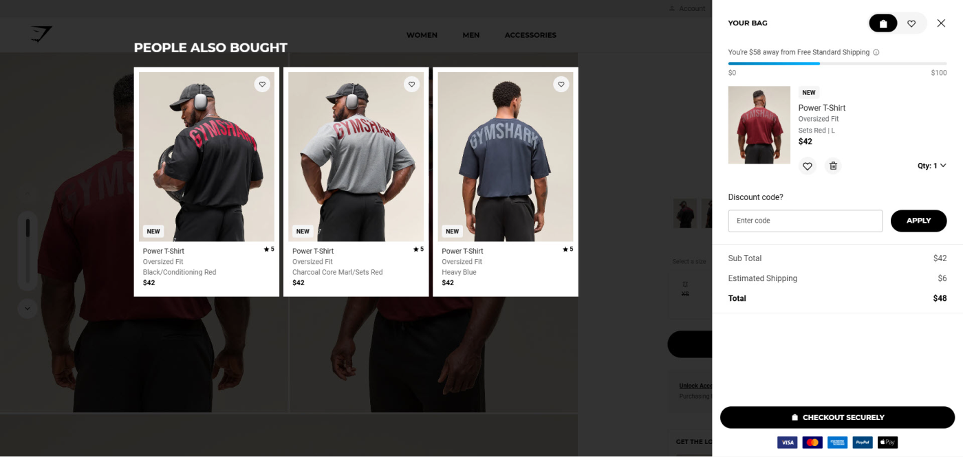
Put a padlock on the checkout button, and payment icons right under it. 10 of the 25 top stores we studied show payment options or card logos in the cart. Gymshark does it cleanly:
Our guide to reducing cart abandonment covers the other reasons shoppers leave the cart.
At checkout
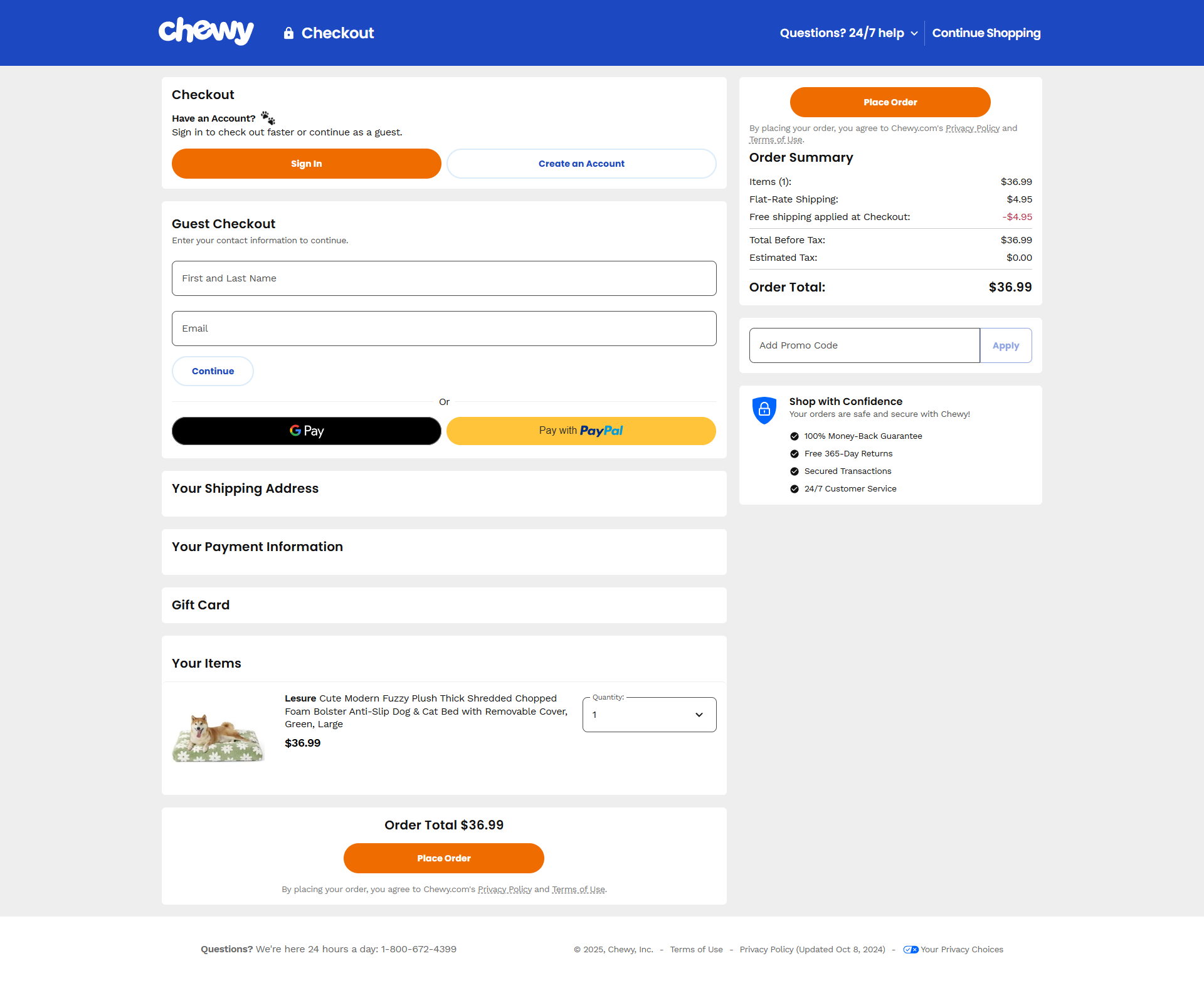
At the payment step, a padlock and a short "your payment is secure" line near the card fields help most. Chewy goes further and adds a "Shop with Confidence" box next to the order summary, with its money-back guarantee, free returns and 24/7 support.
One catch on Shopify: adding your own text or badges inside the checkout steps needs Shopify Plus. On other plans, Shopify's checkout already shows its own security cues, so put your guarantee and payment icons in the cart and on the product page instead. Our Shopify checkout optimization guide shows what you can change on each plan.
What to skip
- Badge walls. 6 or 8 shields in a row look like clutter, and clutter makes people doubt a store.
- Vague claims. "100% Quality" and "Trusted Store" don't answer anything.
- Seals you haven't earned. Only show a certification, award or review logo you actually have, and link it to proof if you can.
- Badges that push the button down. On mobile, the add to cart button should stay easy to reach. Trust cues go right under it, not above it.
Trust badges for supplement stores
Supplement shoppers carry an extra worry: "Is what's in the bottle what's on the label?" Card safety matters less to them than product safety. So the badges that help most are about quality:
- Third-party tested. If an independent lab tests your products, say so, and name the lab or link to the results if you can. A link to a test report is stronger than any icon.
- GMP. In the US, FDA rules (21 CFR Part 111) already require supplement makers to follow good manufacturing practices. So "GMP" on its own is the baseline, not a bonus. A facility certified by an independent group says a bit more.
- Money-back guarantee. Supplements take time to work, so a clear guarantee ("Try it for 60 days or get your money back") lowers the risk of the first order.
Keep badge claims simple and true. Don't use them for health claims, only show certifications you hold today, and check with someone who knows supplement labeling rules if you're unsure.
Social proof and sales pop-ups
Reviews are the trust badge shoppers believe most, because they come from other buyers, not from you. Here are social proof examples from the 25 stores we studied:
- Big review counts. 8 of the 25 show very large review counts. A number like "12,313 reviews" does more than any seal.
- Ratings on collection pages. 14 of 25 show stars before the shopper even opens a product.
- Ratings that answer a worry. Oh Polly adds sub-ratings like "overall fit," which goes straight at the biggest fear of buying clothes online.
- Stock and demand signals. 9 of 25 show things like "In stock" or "Low stock," which tell the shopper the store is real and active.
What about sales pop-ups, the "Sarah from Denver just bought this" notifications? None of the 25 stores we studied call them out. If you use them, use only real data. Fake alerts are dishonest, and shoppers who spot one stop trusting the whole page. On mobile, keep them small and away from the add to cart button.
What our A/B tests show
We've run trust tests on many stores, and the results have gone both ways. Some lifted sales. Many made no difference at all. A few hurt.
The winners had one thing in common: they answered a worry real shoppers had on that page, found in reviews, support emails and surveys. Badges added "because every store has them" rarely moved the numbers.
That's true of testing in general. Of the 1,000+ A/B tests we've run, 37% won. That's well above the industry average of about 15%, and it still means most good-looking ideas don't lift sales. So test badges if you have the traffic, and watch your add to cart and checkout rates if you don't.
Trust is one leak among many. Our ecommerce CRO checklist covers the rest, and if you're getting visitors but few orders, start with why you have traffic but no sales. To see what a small lift is worth, try our revenue calculator.
FAQ
They can, when they answer a real worry at the right moment, like a padlock and card logos next to the checkout button. Generic badge walls usually do little.
Put a returns or shipping promise under the add to cart button, and a padlock with payment icons near the cart's checkout button. Adding your own badges inside the checkout steps needs Shopify Plus.
The ones that answer a specific worry: security cues near payment, payment icons in the cart, a clear returns promise on the product page, and real reviews.
Less than you'd think. Baymard Institute found that a simple homemade secure seal did better than most branded SSL seals. Having a clear security cue near the card fields matters more than the brand.
Third-party testing (with a link to results if you can), a clear money-back guarantee, and only certifications you actually hold. Keep claims simple and avoid health claims.
Written by
Nicolas Fradet
Nicolas is the founder of FunnelSpark, an ecommerce CRO agency. He has spent 16 years finding out why shoppers don't buy, with 1,000+ A/B tests run and a 37% win rate. He wrote Stop Guessing. Start Converting.
Follow Nicolas on LinkedIn →Want us to find what's stopping your shoppers?
On a free 30-minute call, Nicolas looks at your store and shows you 3 growth opportunities, whether we work together or not.
Book your free call