The add to cart button: what top stores do (and how to raise your add to cart rate)
What a good add to cart rate looks like, how to tell if it's your leak, and what the 25 top stores we broke down put on and around the button.

By Nicolas Fradet, founder of FunnelSpark · 16 years in CRO, 1,000+ A/B tests
Updated Nov 6, 2026 · 8 min read
The short answer
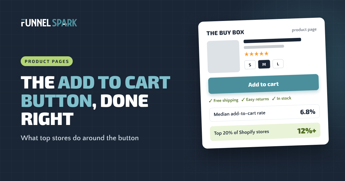
A good add to cart button is the one obvious thing to click, sits by the price, stays in reach on long pages, and has the answers shoppers need right under it: shipping, returns and ways to pay. In Littledata's Shopify benchmarks, the median store gets 6.8% of sessions to add to cart. The top 20% get 12% or more.
What is an add to cart rate?
Your add to cart rate is the share of visits where someone puts at least 1 product in the cart. The formula is simple: sessions with an add to cart ÷ total sessions × 100. 1,000 visits and 70 of them added something? Your add to cart rate is 7%.
On Shopify you don't need to work it out. Open the Conversion rate breakdown report in your analytics. Shopify's help center describes it as a funnel: all sessions, then "sessions with cart additions," then sessions that reached checkout, then sessions that completed checkout. The second step, as a share of all sessions, is your add to cart rate.
Why not just watch conversion rate? Because this number shows where shoppers stop.
What's a good add to cart rate?
Littledata's Shopify benchmarks rank stores from worst to best, which tells you much more than one average. The median store gets 6.8% of sessions to add to cart. The top 20% get 12% or more, the top 10% get 17% or more, and the bottom 20% sit at 3.4% or less.
Where does your add to cart rate sit?
Under 3.4%Bottom 20% of stores. Something on the product page is missing or broken.
3.4% to 6.8%Below the median. The buy box is the first place to work on.
6.8% to 12%Above the median. Test your way into the top 20%.
12% and upTop 20% (17%+ is the top 10%). Your bigger leak is probably after the cart.
Treat these as a rough guide. A store selling cheap refills will see a higher rate than one selling sofas, so your best comparison is your own store last month. For the full picture, see our ecommerce conversion rate benchmarks.
Is your add to cart rate the leak?
Before you touch the button, check where people actually drop. Put your add to cart rate next to the other steps in the Shopify funnel and read it like this:
| What you see | What it usually means | Look here first |
|---|---|---|
| Low add to cart rate | Shoppers aren't convinced on the product page | Photos, price, reviews and the buy box (this article) |
| Good add to cart rate, few checkouts | Something in the cart scares them off, often the shipping cost | The cart and your free shipping threshold |
| Checkouts started, few orders | Friction or surprises in checkout | Our Shopify checkout fixes |
| Low at every step | The wrong visitors, or ads that promise something the page doesn't show | Traffic but no sales? |
When the add to cart rate is low, store owners blame the button first. Most of the time the button is fine. It's the questions nobody answered above it.
What makes a good add to cart button?
A good add to cart button doesn't need to be clever. It needs to be impossible to miss. Here's what we look for when we review a product page at FunnelSpark, an ecommerce CRO agency for Shopify stores:
- One color nothing else uses. There's no magic button color. What matters is contrast: the button should be the strongest color in the buy box. Oh Polly uses a contrasting button color, and Blackstone's notes call out a "clear CTA that pops."
- Plain words. "Add to cart" or "Add to bag." Shoppers know exactly what happens next.
- Big enough for a thumb. On mobile, a full-width button is the safe default. Check it on a real phone, not only on your laptop.
- Right next to the price and options. What is it, what does it cost, which size, add: keep those 4 in one tight block.
- One main button. Baymard Institute warns that competing buttons are distracting and make it needlessly hard to add the product to the cart. "Add to wishlist," "Find in store" and "Share" can be links, not big buttons.
What about Shopify's "Buy it now" button? Shopify's help center explains that these accelerated checkout buttons show with the Add to cart button and send shoppers straight to checkout, skipping the cart. Branded versions show logos like Shop Pay or PayPal instead. Quicker for some shoppers, but they skip your cart offers. You can show or hide them, so test it.
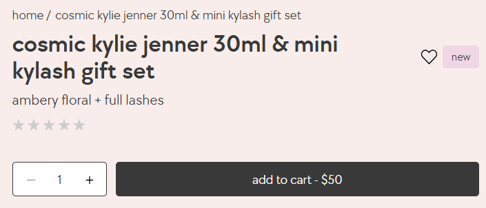
One small idea worth stealing: put the price on the button itself. It saves space and removes one more "how much was it?" glance.
What top stores put around the button
We broke down 25 top online stores page by page, including Gymshark, Crocs, Chewy, SKIMS and Fenty Beauty. The button itself looked ordinary on almost all of them. The work happened in the few inches around it, where each store answers the last worries before the click:
What the 25 top stores do
| Near the button | Stores |
|---|---|
| Ratings and reviews on the product page | 23 of 25 |
| A security mention somewhere in the funnel (Quad Lock puts a lock icon on the button) | 19 of 25 |
| A guarantee or returns promise | 12 of 25 |
| Visual color swatches or shade pickers | 12 of 25 |
| Pay later options (9 of them on the product page) | 11 of 25 |
| Shipping or delivery details before checkout | 9 of 25 |
| Stock, urgency or demand signals | 9 of 25 |
| A size guide or the model's size | 8 of 25 |
| A sticky add to cart | 3 of 25 |
Counts are what our notes call out, so read each one as "at least."
Reviews answer "is it good?" Swatches and size guides answer "will it suit me?" Shipping, returns and pay later answer "what if it goes wrong?"
Blueland does this in about 3 lines. Cambridge Satchel keeps its delivery details open by default, so shoppers don't even have to tap. KEEN shows "Low stock" when it's true, plus delivery and returns details. Our product page optimization guide covers the rest of the page above the button.
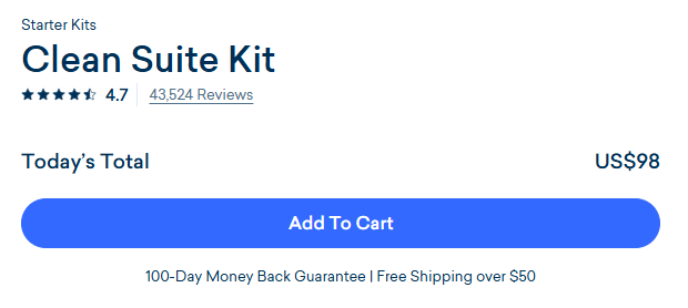
If you add trust badges near the button, keep them few and real. Only 8 of the 25 stores show trust-type badges or logos at all. Here's what we found on trust badges.
Should you use a sticky add to cart?
A sticky add to cart is a small bar that stays on screen as shoppers scroll, so the button is always one tap away. Only 3 of the 25 top stores we broke down use one: Bodybuilding.com, Quad Lock and Cambridge Satchel. All 3 have long product pages, with plenty of details and reviews below the button.

Does it work? It depends on the page. On a long product page, shoppers often scroll away from the button just as they make up their mind, and a sticky bar keeps it within reach. On a short page, it mostly adds clutter. That makes it a good idea to test, not a sure thing.
Our rule of thumb: if your page runs longer than about 2 phone screens, test a sticky bar on mobile with the name, price and button. If a size must be picked first, have the button scroll shoppers back to the options.
What happens after the click
Shoppers need to see that the click worked. A cart drawer that slides open beats a tiny number changing on a cart icon. Sanrio opens a cart drawer instantly.
That moment is also when shoppers are most open to one more item. 22 of the 25 top stores we broke down cross-sell or upsell before checkout, and 19 do it in the cart itself. Quad Lock shows an order bump the moment you add to cart. Keep it to 1 or 2 add-ons that fit what's already in the cart. Our guide to upsells vs cross-sells shows how top stores do it.
Then carry the same promises into the cart: shipping, returns, ways to pay. Adding your own text inside Shopify's checkout steps needs Shopify Plus, so the cart is the last easy place to repeat them.
7 tests to raise your add to cart rate
Here's the order we'd work through on most stores, from the cheapest fix to the bigger builds:
- Answer shipping and returns under the button. One short line: free shipping threshold, delivery time, returns window. Only promise what's true.
- Make the button the one obvious thing. Strongest color in the buy box, full width on mobile, other actions turned into links.
- Show stars and the review count near the product name. If shoppers have to hunt for reviews, many won't.
- Remove friction from picking options. Visual swatches, a size guide next to the sizes, and a clear message if someone taps the button without choosing.
- Add pay later under the price if your products cost more than an impulse buy. 11 of the 25 top stores offer it.
- Test a sticky add to cart on mobile if your product page is long.
- Confirm the add and suggest 1 add-on. A cart drawer with a relevant extra helps both your add to cart rate and your average order value.
How do you judge these tests? Add to cart rate is a fast signal, which helps when traffic is low: proving a 10% lift in orders at a 2% conversion rate takes about 161,000 visitors. But fuller carts don't always mean more money, so confirm winners on orders and revenue per visitor. Our guide to ecommerce A/B testing explains how to set up the test.
Not sure which of these your store needs? Our free Leak Finder walks you through 20 checks from homepage to checkout, and our 15 fixes to increase your Shopify conversion rate covers the rest of the funnel.
FAQ
In Littledata's Shopify benchmarks, the median store gets 6.8% of sessions to add to cart. The top 20% reach 12% or more and the top 10% reach 17% or more. Under 3.4% puts a store in the bottom 20%. Compare against your own past numbers too.
Divide the number of sessions with at least 1 add to cart by your total sessions, then multiply by 100. On Shopify, the Conversion rate breakdown report shows sessions with cart additions next to all sessions, so you can read it there.
It can, mostly on long product pages. On a long page, it keeps the button within reach while shoppers make up their mind. Only 3 of the 25 top stores we broke down use one, so test it.
There's no best color. Pick a color that contrasts with the rest of your page and that nothing else in the buy box uses, so the button is the first thing the eye lands on.
Shopify's Buy it now and branded payment buttons send shoppers straight to checkout and skip the cart. That's quicker for some shoppers but skips your cart offers, so A/B test showing vs hiding them and judge by revenue per visitor.
Written by
Nicolas Fradet
Nicolas is the founder of FunnelSpark, an ecommerce CRO agency. He has spent 16 years finding out why shoppers don't buy, with 1,000+ A/B tests run and a 37% win rate. He wrote Stop Guessing. Start Converting.
Follow Nicolas on LinkedIn →Want us to find what's stopping your shoppers?
On a free 30-minute call, Nicolas looks at your store and shows you 3 growth opportunities, whether we work together or not.
Book your free call