Facebook ads landing pages for ecommerce: what to put on them
How to match the page to the ad, when to use a product page or a dedicated landing page, what goes above the fold, and how to make it work on a phone.

By Nicolas Fradet, founder of FunnelSpark · 16 years in CRO, 1,000+ A/B tests
Updated Nov 13, 2026 · 8 min read
The short answer
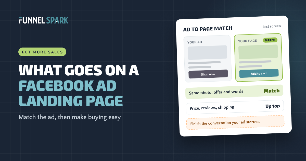
A Facebook ads landing page should finish what your ad started. Show the same product, offer and words from the ad on the first screen, with the price, star rating, shipping info and an add to cart button. Send single-product ads to the product page. Build a dedicated page for bundles, special offers or new products that need explaining.
What is a Facebook ads landing page?
It's the page people land on after they tap your ad on Facebook or Instagram. For most stores, that's a product page. For some, it's a page built only for that ad: 1 product or bundle, 1 offer, 1 button.
Either way, the job is the same. Most people who tap your ad weren't shopping 5 seconds ago. They were scrolling past friends' photos. Your ad made them a promise, and the page has to keep it before their interest fades.
It will also be seen on a phone. Statista reports that over 98% of active Facebook accounts use it on a mobile phone. So design the page on a phone first, and check it there before you spend a dollar on ads.
Why ad-to-page match matters most
The fastest way to waste ad money is a page that doesn't look like the ad. Someone taps a sand-colored linen shirt with a free shipping offer, then lands on your homepage, a collection of 40 shirts, or a product page where the offer is nowhere to be seen. They don't go looking for it. They hit back.
Ad-to-page match (marketers also call it "message match") means the first screen picks up exactly where the ad left off. Check 4 things:
Ad-to-page match: 4 things to carry over
Your ad
to
Your first screen
Then add what the ad couldn't fit: the price, star rating, shipping and returns.
Two details trip up most stores. First, the variant: if the ad shows the blue one, preselect blue. Second, the code: if the offer needs one, apply it for shoppers. Shopify's help center explains that a shareable discount link applies the code automatically at checkout and can send shoppers to a specific product page.
Meta cares about the page too. Its advertising standards say ads "need to provide a high quality experience, which includes the ad destination." For Meta, the click is the middle of the experience, not the end.
Think of your ad as the first half of a sentence. The landing page has to finish it. If shoppers have to look for the thing they tapped on, most won't, and you've already paid for the click.
Product page or dedicated landing page?
Start with the product page. It already has the price, options, reviews and the button. Build a dedicated page when the ad needs more explaining than a product page can give. Here's how we'd decide:
| Your ad shows… | Send traffic to | Why |
|---|---|---|
| 1 product people already understand | The product page | Everything a buyer needs is there. Just make sure the top of it matches the ad. |
| A product they already viewed (retargeting) | The product page | They know the product. Don't make them read a sales page again. |
| Several products or a range | A collection with only those products | A single product page hides the choice they tapped for. A full catalog buries it. |
| A bundle or kit | A dedicated page or a bundle product page | Shoppers need to see what's inside and what they save. |
| A special offer (gift, BOGO, launch deal) | A dedicated page | The offer should be the headline, not a line under the price. |
| A new product, or a problem people don't know they have | A dedicated page | Cold shoppers need the story: the problem, how it works, and proof. |
| Anything | Not the homepage | It makes shoppers find the product all over again. |
On Shopify, you don't need a page builder to make a dedicated page. If your theme supports it, Shopify lets you create a new product template in the theme editor and assign it to the products you advertise. That way the page keeps the real add to cart button and checkout, with a longer story around it. For bundles and offers, our guides to bundle pricing and BOGO vs gift with purchase vs discount help you pick what to put in the headline.
Not sure which page wins? Test it. Split the same ad between the product page and the new page, and compare revenue per visitor, not only conversion rate. Our guide to ecommerce A/B testing shows how.
What to put above the fold
"Above the fold" is what shows before anyone scrolls, and it gets the most attention. In a Nielsen Norman Group eye-tracking study, people spent about 57% of their viewing time above the fold and 74% in the first 2 screens. On a phone that first screen is small, so everything in it has to earn its place. In order:
- A headline that repeats the ad's promise. On a product page, a short benefit line by the product name does the job.
- The photo from the ad, or one very close to it.
- The price, plus the offer if there is one. A hidden price makes cold shoppers assume it's high.
- Star rating and review count. 23 of the 25 top stores we broke down show ratings and reviews on the product page.
- The add to cart button, in a color nothing else on the page uses. More on that in our guide to the add to cart button.
- 1 line of reassurance under the button: shipping, returns or a guarantee. 12 of the 25 top stores make a guarantee or returns promise, and 9 show shipping or delivery info before checkout.
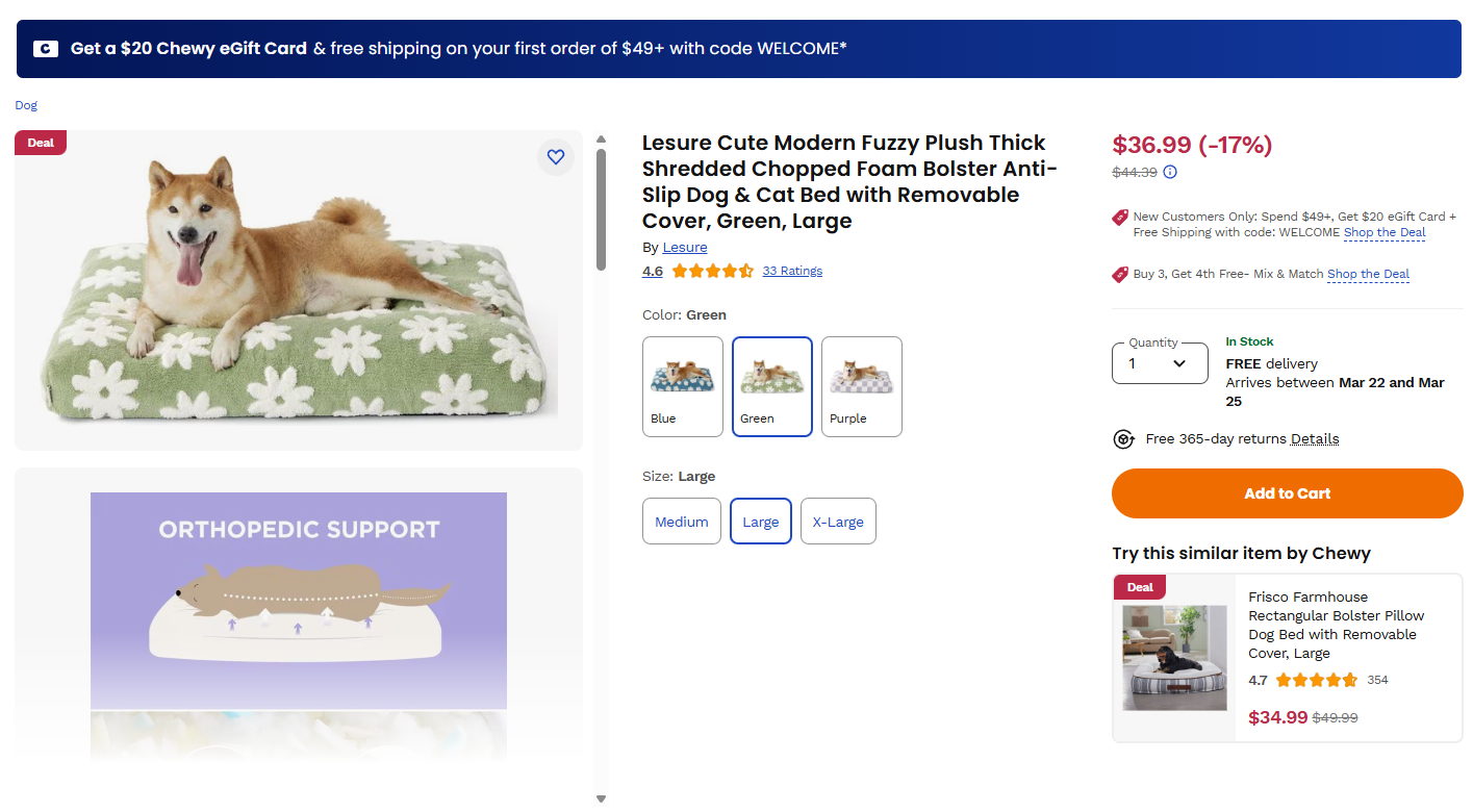
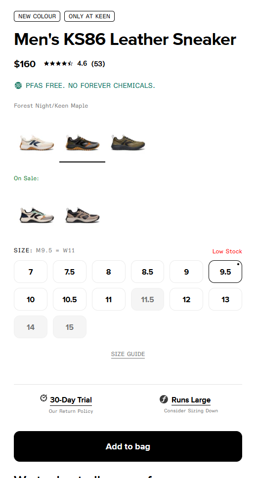
Notice what's not on that screen: no slider, no brand video, no pop-up. The other trick is to answer last-second worries right by the button. For clothing and shoes, that's fit. For anything pricey, it's "what if I don't like it?"
What to put below the fold
Shoppers who scroll are interested but not sure yet. Below the fold is where you answer the questions that stop them, in roughly the order they come up:
- What's in it for me? 3 to 5 benefits in plain words, with photos of the product in use.
- How does it work? For anything new, show it in 3 steps or a short video.
- Do people like it? Reviews with photos, best ones first. If shoppers worry about fit or taste, let reviews rate that too.
- Is it the right one for me? A size guide, what's in the box, or a simple comparison with the other options.
- What if it doesn't work out? Shipping times, returns and any guarantee, in one block.
- Anything left? A short FAQ, then the add to cart button again at the bottom.
On a product page, tuck the long parts into tabs or accordions so the button stays high. 16 of the 25 top stores we broke down use accordions or tabs on their product pages. Our product page optimization guide covers the rest of the page.
How to make it work on a phone
- Make it fast. In a study by Deloitte, commissioned by Google, a 0.1-second faster mobile site lifted retail conversion rates by 8.4% (web.dev summary). Compress images, remove apps you don't use, and keep heavy videos off the first screen.
- Keep the button in reach. On a long product page, a sticky add to cart bar keeps it on screen. Only 3 of the 25 top stores use one, so test it before you roll it out.
- Offer express pay. Shopify's accelerated checkout buttons show with the Add to cart button and let shoppers pay with details they've already saved, such as Shop Pay, Apple Pay, Google Pay or PayPal, depending on what you've turned on. That's a lot less typing on a small screen.
- Hold the pop-up. A pop-up that covers the first screen hides the very thing the shopper tapped on. If you use one, delay it.
How to tell if your landing page is the problem
Ads Manager tells you how the ad did. Your store analytics tell you how the page did. Line them up for one ad at a time. Meta's landing page views metric exists to give advertisers "a better sense of the number of visitors that arrive to your website after a link click on an ad," so compare it with link clicks first.
| What you see | What it usually means | Fix first |
|---|---|---|
| Many link clicks, far fewer landing page views | People leave before the page loads | Page speed, redirects, heavy apps |
| Landing page views are fine, few add to carts | The page doesn't keep the ad's promise or answer the shopper's questions | Ad-to-page match and the first screen |
| Add to carts are fine, few orders | The leak is in the cart or checkout | Our guide to reducing cart abandonment |
| Plenty of orders, still no profit | The ad costs more than each order earns | Your break-even ROAS and order value |
Meta and your store count visits differently, so compare trends, not exact numbers. And remember why this matters: a better landing page lowers what each sale costs without touching the ad. If the same clicks convert 20% better, each order costs about 17% less in ad spend. That's why we judge landing page tests by revenue per visitor.
6 landing page mistakes that waste ad spend
- Sending ads to the homepage. Shoppers have to find the product all over again.
- An offer in the ad that's missing on the page. It looks like a bait and switch, even when it isn't.
- A code shoppers have to remember. Use a shareable discount link so it applies itself.
- The wrong color or variant picked. The ad showed blue; the page opens on black.
- A pop-up over the first screen. The shopper's first sight is a form, not the product.
- Judging the page by conversion rate alone. A page that adds a discount can win on orders and lose on profit.
At FunnelSpark, an ecommerce CRO agency for Shopify stores, the page your ads point to is one of the first places we look when a store spends more on ads but sales don't follow. Our free Leak Finder walks you through 20 checks from homepage to checkout, and our list of 15 fixes to increase your Shopify conversion rate covers the rest of the funnel.
FAQ
The same product, offer and words as the ad, plus the price, star rating, a clear add to cart button and 1 line about shipping, returns or a guarantee, all on the first screen. Below that: benefits, how it works, reviews, sizing or comparisons, and an FAQ.
Send ads for a single, easy-to-understand product to its product page, and retargeting ads too. Build a dedicated landing page for bundles, special offers and new products that need explaining. Never send ad traffic to your homepage. If you're unsure, A/B test both and compare revenue per visitor.
Compare link clicks with landing page views in Ads Manager. A big gap means people leave before the page loads. If they arrive but don't add to cart, the page probably doesn't match the ad or answer their questions. If they add to cart but don't buy, look at your cart and checkout.
On a dedicated landing page, a slimmed-down header with no full menu keeps attention on the offer. On a product page, keep your normal menu, but make sure the first screen is all about the product from the ad.
As fast as you can make it. In a study by Deloitte, commissioned by Google, a 0.1-second faster mobile site lifted retail conversion rates by 8.4%. If Ads Manager shows far fewer landing page views than link clicks, speed is the first thing to fix.
Written by
Nicolas Fradet
Nicolas is the founder of FunnelSpark, an ecommerce CRO agency. He has spent 16 years finding out why shoppers don't buy, with 1,000+ A/B tests run and a 37% win rate. He wrote Stop Guessing. Start Converting.
Follow Nicolas on LinkedIn →Want us to find what's stopping your shoppers?
On a free 30-minute call, Nicolas looks at your store and shows you 3 growth opportunities, whether we work together or not.
Book your free call