Ecommerce copywriting that sells: a simple guide for store owners
How to write headlines, product descriptions, bullets and the small lines near your buy button, using your customers' own words. With before and after rewrites you can copy.

By Nicolas Fradet, founder of FunnelSpark · 16 years in CRO, 1,000+ A/B tests
Updated Oct 31, 2026 · 9 min read
The short answer
Ecommerce copywriting is the words on your store that help a shopper decide to buy: headlines, product descriptions, bullets and the short lines near the buy button. Copy that sells is clear before clever. It uses your customers' own words, leads with what the product does for them, and answers each worry where it shows up.
What is ecommerce copywriting?
Ecommerce copywriting is every word a shopper reads on the way to buying: your homepage headline, collection page intros, product names and descriptions, bullets, button labels, cart messages and FAQ answers. Its only job is to help the right person feel sure enough to buy.
A shopper on your product page is already interested. They don't need to be dazzled. They need answers: What is it? Is it for me? What if it doesn't work?
And they won't read much. Jakob Nielsen of the Nielsen Norman Group looked at more than 45,000 page views and found people read about 20% of the words on an average page. So the 20% they do read has to carry the sale. Yet the words matter: in Baymard Institute's product page testing, every single user relied on the product description at some point to decide if a product suited them.
The rule we use at FunnelSpark, an ecommerce CRO agency for Shopify stores: clear beats clever, every time.
Start with your customers' words
The best copy on most stores isn't written. It's collected. Your customers have already told you why they bought, what almost stopped them and how they describe your product. Your job is to find those words and put them on the page.
Most store owners write about the product they made. Shoppers want to read about the problem they have. Start from their words, not yours.
Here's where to look and what to pull out:
| Where to look | What to look for | Where it goes |
|---|---|---|
| Your 5-star reviews | The result people got, in their words ("my coffee is still hot at lunch") | Headlines, bullets |
| Your 3-star reviews | What surprised or disappointed people (sizing, color, setup) | Product details, FAQ |
| Competitors' 1 and 2-star reviews | The worries shoppers bring to your category | Bullets, guarantee line |
| Support emails and chats | The questions people ask before they buy | FAQ, microcopy near the button |
| A post-purchase survey | Why they bought and what nearly stopped them | Headlines, the worry-killer line |
For the survey, 2 open questions on your thank-you page are enough: "What almost stopped you from buying today?" and "What would you tell a friend about this product?" After 50 to 100 answers, you'll see the same phrases come back. Those phrases are your copy.
Reviews do double duty. Of the 25 top stores we broke down page by page, 23 show ratings and reviews on the product page. Oh Polly goes further and adds ratings for fit, which answers the biggest worry when buying clothes online.
How do you write a headline that sells?
A store headline has one job: tell the right shopper, in a second or two, that they're in the right place. On a homepage or collection page, that means what you sell and why it's better for them. A simple pattern that works:
- Headline: the result the shopper wants, in a few plain words.
- Subhead: what the product is and the detail that makes the promise believable.
- Button: where the click goes ("Shop leggings", not "Learn more").
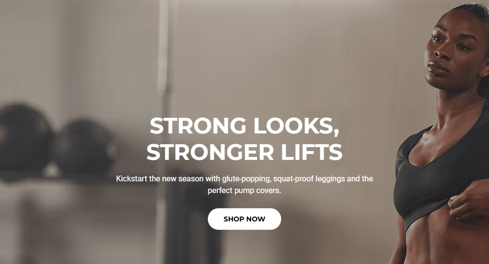
Notice what the subhead does. "Squat-proof" isn't a fancy word. It's the exact worry people have about gym leggings, answered in 2 syllables. That's what customer research gives you.
Clever headlines work for brands everyone already knows. If shoppers don't know you yet, a headline that makes them guess makes them leave. Getting visits but few sales? Start with our guide to traffic but no sales.
How do you write a product description that sells?
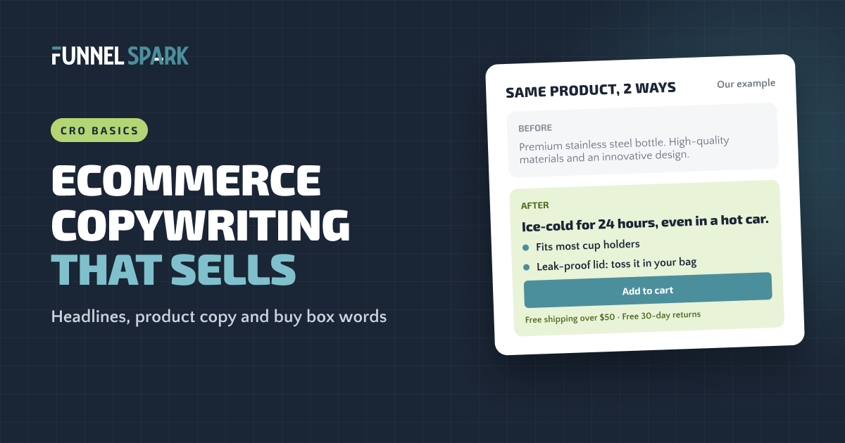
Most product descriptions describe the product. The ones that sell describe the shopper's life with the product. Here's an example we wrote for a made-up water bottle:
| Our example | Before | After |
|---|---|---|
| Product description | Premium stainless steel bottle. High-quality materials and an innovative design. | Ice-cold for 24 hours, even in a hot car. Fits most cup holders. Leak-proof lid: toss it in your bag. |
The "before" uses words every store uses: premium, high-quality, innovative. They don't tell the shopper anything they can picture. The "after" gives 3 facts the shopper can imagine, each tied to a moment in their day. (Only promise what you've checked. If your bottle keeps drinks cold for 12 hours, say 12.)
A simple structure for a product page:
Where the copy goes on a product page
Trail Bottle, 750 ml
Ice-cold for 24 hours, even in a hot car.
★★★★★ Read the reviews
- Fits most cup holders
- Leak-proof lid: toss it in your bag
- Dishwasher safe, lid and all
Free shipping over $50 · Free 30-day returns
Will it fit my car's cup holder? +
Does the lid really not leak? +
- Name + one-line promise. What it is, and the main reason to want it.
- 3 to 5 benefit-first bullets. The fact first, then what it does for the shopper.
- Price and a plain button. "Add to cart", right next to the price.
- The worry-killer line. Shipping, returns or guarantee, right under the button.
- Answers to what's left. The questions shoppers really ask, in their words.
Below the bullets, the longer description can cover the story, specs and care, in short labeled chunks. Baymard suggests structuring descriptions around roughly 2 to 6 key "highlights" rather than a wall of text. Accordions help too: 16 of the 25 top stores we broke down use accordions or tabs on the product page. Our product page optimization guide covers the rest of the page, and our FAQ page examples show how to turn support questions into answers that sell.
Benefit-first bullets
Bullets are the easiest copy to scan, so they get read. A feature says what the product has. A benefit says what that does for the shopper. The best bullets give both, in that order: the fact, then the "so what."
| Feature (what it has) | Benefit (what it does for them) |
|---|---|
| Double-wall steel | Ice stays ice through a full day outside |
| 4-way stretch fabric | Squat, lunge and bend without it slipping down |
| Machine washable cover | Spills are a 2-minute fix, not a stain |
| Ships in 1 box, no tools | Set up in 10 minutes on your own |
A quick test: read each bullet and ask "so what?" If the answer isn't already in the bullet, add it. "Breathable cotton" becomes "Breathable cotton, so you don't wake up hot."
Keep the tone plain. In a Nielsen Norman Group study, a version of a site written to be concise, scannable and objective scored 124% higher in measured usability than the promotional version. Hype words make shoppers work harder to find the facts.
The words near your buy button
Microcopy is the small text around your buy button: the label, the line under it, the note by the size picker. It's read at the exact moment the shopper decides, when the last worries show up: shipping cost, returns, "what if it doesn't fit?"
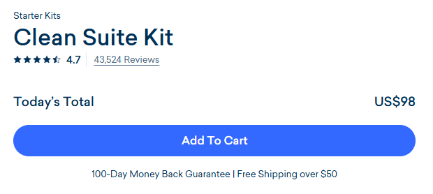
Of the 25 top stores we broke down, 12 show a guarantee or returns promise and 18 run an announcement or USP bar with their key promises. Here's microcopy worth testing on your store:
- Under the button: your shipping and returns promise in 1 line. Only what's true.
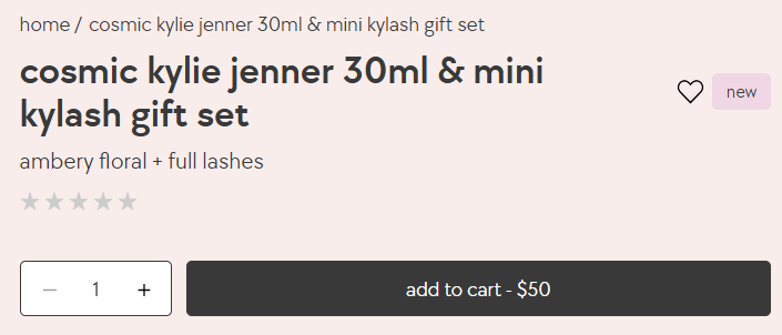
- On the button: plain words ("Add to cart"). Some stores add the price, like Kylie Cosmetics' "add to cart - $50".
- Next to sizes: the fit advice your reviews keep giving ("Runs small? Most reviewers size up.").
- In the cart: how far they are from free shipping, and a reminder of your returns policy.
What about the checkout? Shopify's checkout is a single page by default, and adding your own text inside the checkout steps, near the pay button, needs Shopify Plus. On other plans, the product page and the cart are your last places to reassure. If you use badges near the button, keep them few and real: here's what we found on trust badges.
Before and after: 6 rewrites
These are our own examples for made-up products, not tests from real stores. Use them as patterns, then fill in your facts and your customers' words.
| Where | Before | After (our example) |
|---|---|---|
| Homepage headline | Welcome to Luna Linen | Sheets for people who sleep hot. Cool, soft linen, delivered free. |
| Product headline | Premium stainless steel bottle | Ice-cold for 24 hours, even in a hot car |
| Bullet | Ergonomic design | Fits your hand and your cup holder |
| Under the button | (nothing) | Free shipping over $50 · Free 30-day returns |
| Size picker | Size chart | Between sizes? Most reviewers say size up. |
| FAQ answer | Please see our returns policy. | Yes. Send it back within 30 days, even if you've worn it. Returns are free. |
How do you know your copy works?
You test it. Copy feels like a matter of taste, which is why teams argue about it. An A/B test settles it: half your visitors see the old words, half see the new ones, and you compare orders and revenue per visitor.
Expect surprises. Across 1,000+ A/B tests, 37% of ours have won, against an industry average of about 15%. Most ideas don't beat what's already there, which is why we start with customer research.
Low traffic? Proving a 10% lift at a 2% conversion rate takes about 161,000 visitors. With less, show your new copy to 5 people who match your customer and ask them what the product does and what would stop them buying. Then watch faster signals like your add to cart rate. Our guide to ecommerce A/B testing shows how to set up a test, and our intro to CRO explains where copy fits in the bigger picture.
Start with the page that gets the most traffic and drop-off, usually your best-selling product page. Our free Leak Finder walks you through 20 checks from homepage to checkout to find it.
FAQ
Ecommerce copywriting is the words on an online store that help shoppers decide to buy: homepage and collection headlines, product names and descriptions, bullets, button labels, cart messages and FAQ answers. Good store copy is clear, uses customers' own words and answers their worries where they show up.
Long enough to answer the questions shoppers ask before they buy, and no longer. Lead with a one-line promise and 3 to 5 benefit-first bullets. Put specs, care and the story below, in short labeled chunks or accordions, so shoppers who want detail can find it.
A feature is what the product has, like double-wall steel. A benefit is what that does for the shopper, like ice that lasts all day. The best bullets give the feature first and then the benefit, so the claim is both clear and believable.
AI is fine for a first draft, but on its own it tends to write the same vague words every store uses. Give it your customers' words from reviews, surveys and support emails, check every claim against your real product, and edit until it sounds like you talking to a customer.
Run an A/B test and judge it on orders and revenue per visitor, not on opinions. If your store doesn't have enough traffic for a test, show the copy to a few people who match your customer, ask what the product does and what would stop them buying, and watch your add to cart rate.
Written by
Nicolas Fradet
Nicolas is the founder of FunnelSpark, an ecommerce CRO agency. He has spent 16 years finding out why shoppers don't buy, with 1,000+ A/B tests run and a 37% win rate. He wrote Stop Guessing. Start Converting.
Follow Nicolas on LinkedIn →Want us to find what's stopping your shoppers?
On a free 30-minute call, Nicolas looks at your store and shows you 3 growth opportunities, whether we work together or not.
Book your free call