Crocs Marketing Strategy: 8 Store Tactics Worth Stealing
We went through the Crocs online store page by page, from the homepage to checkout. Here are the 8 moves that stood out, and how to use them on your store.

By Nicolas Fradet, founder of FunnelSpark · 16 years in CRO, 1,000+ A/B tests
Updated Oct 28, 2026 · 8 min read
The short answer
Crocs' marketing gets people to the store with collabs, celebrities and charms. The store then does the basics on every page: a free shipping offer that follows you to checkout, easy ways to pick your path, huge review counts, sale prices you can't miss, pay later, small add-ons, and a checkout that shows where you are.
Why look at Crocs' store?
Most people know Crocs' marketing from the outside: the collabs, the celebrities, the charms. That's the part that brings people in. But a big brand still has to turn those visitors into orders, one page at a time.
Crocs is one of the 25 top stores we broke down page by page, from the homepage to checkout. We looked at its Canadian store, so the prices below are in C$. Here are the 8 tactics that stood out. None of them needs a big budget.
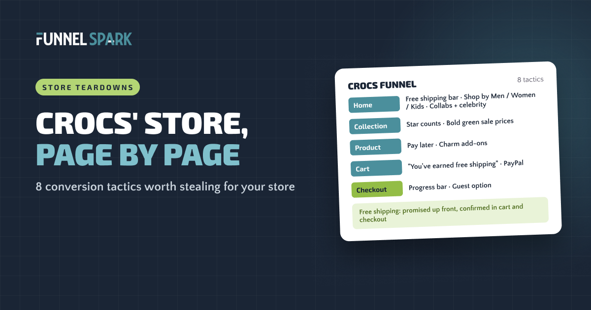
Where the 8 tactics sit in Crocs' funnel
Homepage
- 1Free shipping offer in the top bar
- 2Shop by Men, Women, Kids
- 3Collabs and a celebrity
Collection
- 4Stars and review counts on product boxes
- 5Bold green sale prices
Product
- 6Pay later under the price
- 7Charm add-ons
Cart
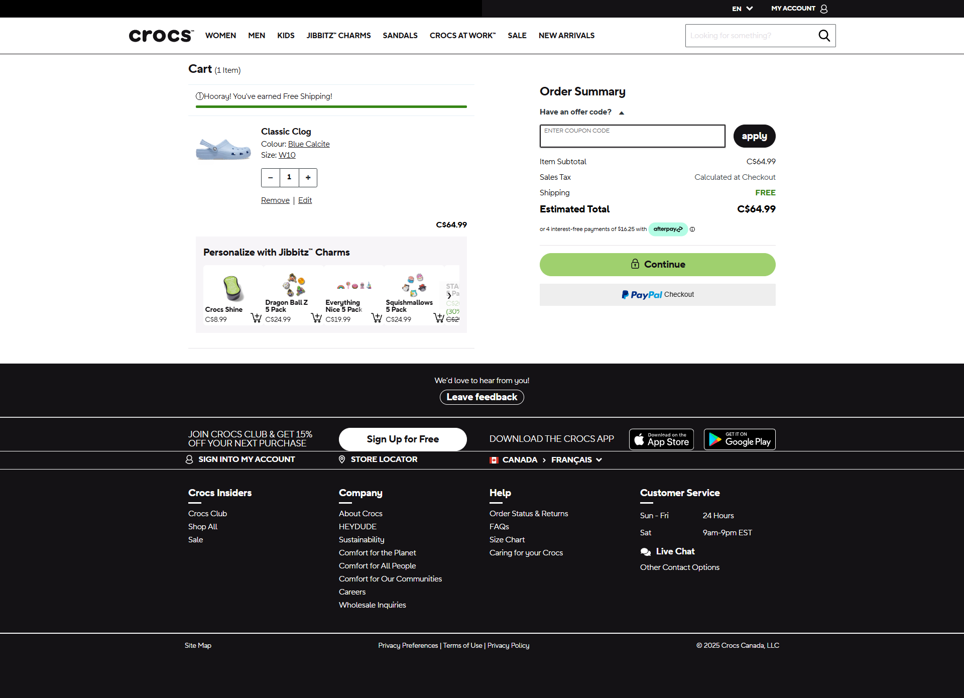
- 1“You've earned free shipping”
- 6PayPal and pay later
- 7More charms
Checkout
- 8Progress bar and guest option
- 1Free shipping confirmed
Tactic 1 runs through the whole funnel: the free shipping offer is promised on the first screen and confirmed again in the cart and at checkout.
Homepage: 3 tactics
1. Put the free shipping offer on the first screen, then keep confirming it
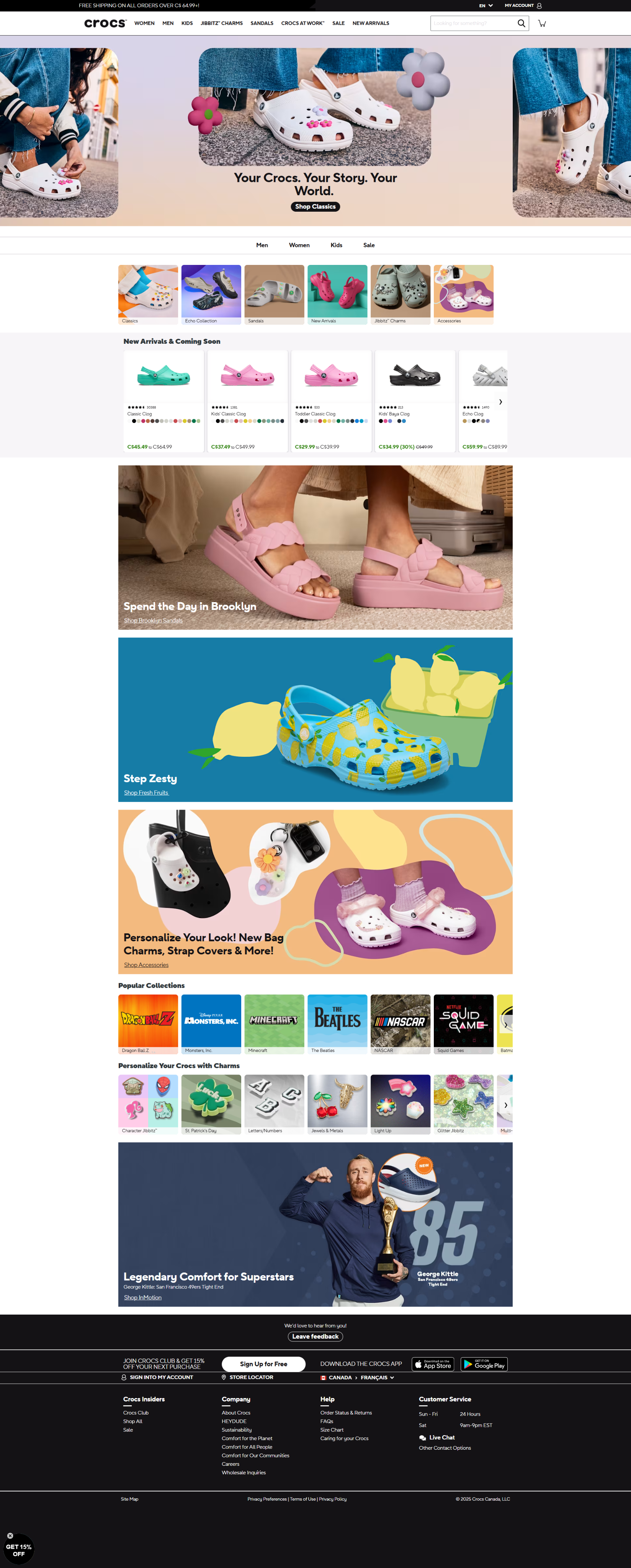
The very top of Crocs' store was a black bar: free shipping on all orders over C$64.99. It showed on every page. The product page repeated it right under the add to cart button, the cart says “Hooray! You've earned Free Shipping!” and checkout confirms it again.
Why it works: extra costs are the top reason shoppers leave at checkout, cited by 40% of them in Baymard's research. Crocs answers that worry before it starts, then proves the promise was real. Of the 25 top stores we broke down, 17 promote free shipping somewhere, but only 10 confirm it in the cart or checkout. Our guide on how to set your free shipping threshold shows how to pick the number.
2. Let shoppers sort themselves
Right under the hero, Crocs showed 4 links (Men, Women, Kids, Sale) and a row of photo tiles: Classics, Sandals, New Arrivals, Jibbitz charms and more. On the collection page, it did it again with color tiles: tap “Pink” and you only see pink clogs.
Why it works: a visitor who lands on your homepage has one question, “Where's the thing for me?” Photo tiles answer it in 1 tap, with no reading. 20 of the 25 top stores we broke down use photo tiles or buttons like these on the homepage.
3. Borrow fame: collabs and a celebrity
Further down, Crocs showed a “Popular Collections” row of licensed collabs (Dragon Ball Z, Minecraft, The Beatles, NASCAR and more) and a big banner with NFL tight end George Kittle. This is the heart of Crocs' marketing strategy, and the store puts it to work too.
Why it works: people trust what the names they already love have picked. A collab also gives fans of that show or team a reason to buy now, before the drop sells out. 6 of the 25 top stores we broke down use a celebrity. You don't need an athlete, though. A well-known creator in your niche, a press logo or a partner brand does the same job on a smaller scale.
Collection page: social proof at scale
4. Show the stars and the review count on every product
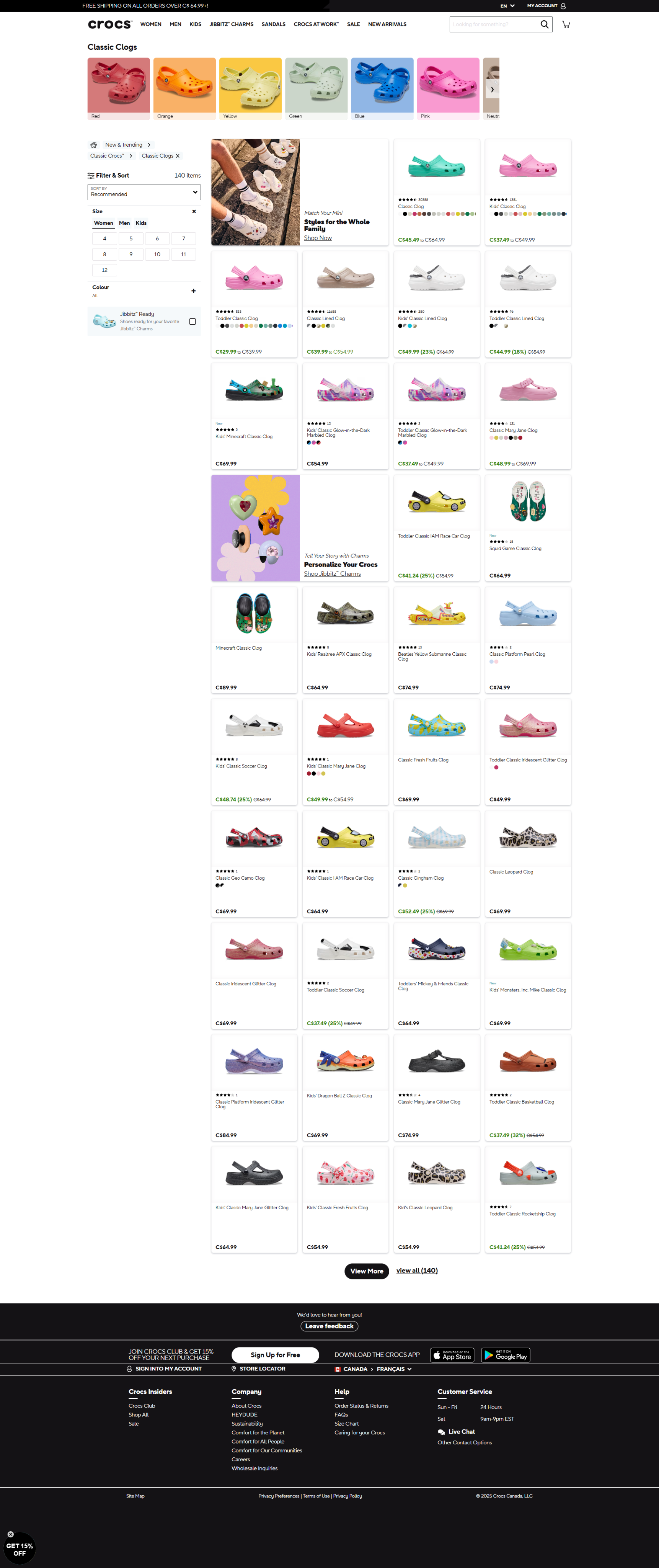
On Crocs' Classic Clogs page, most product boxes showed star ratings with the number of reviews. The Classic Clog had more than 30,000. On the product page, the reviews block showed a 4.7 average and said 86% of reviewers would recommend it to a friend.
Why it works: a big number does the convincing for you. 30,000 people can't all be wrong. Only 14 of the 25 top stores we broke down show star ratings on their collection pages, and 8 lean on massive review counts like this. If your reviews are hidden until the product page, shoppers who browse never see them.
5. Make the sale price impossible to miss
When a product was on sale, Crocs crossed off the old price and showed the new one in bold green, with the percent off next to it: “C$49.99 (23%)”. Full-price items stayed in plain black, so the deals pop out while you scroll.
Why it works: the crossed-off price anchors the value, and the color does the scanning for the shopper. 9 of the 25 top stores we broke down show crossed-off prices. Only cross off a price when the sale is real, though. A fake “was” price costs you trust, and in many places it breaks advertising rules.
Product page: price and add-ons
6. Answer “it's too expensive” before they think it
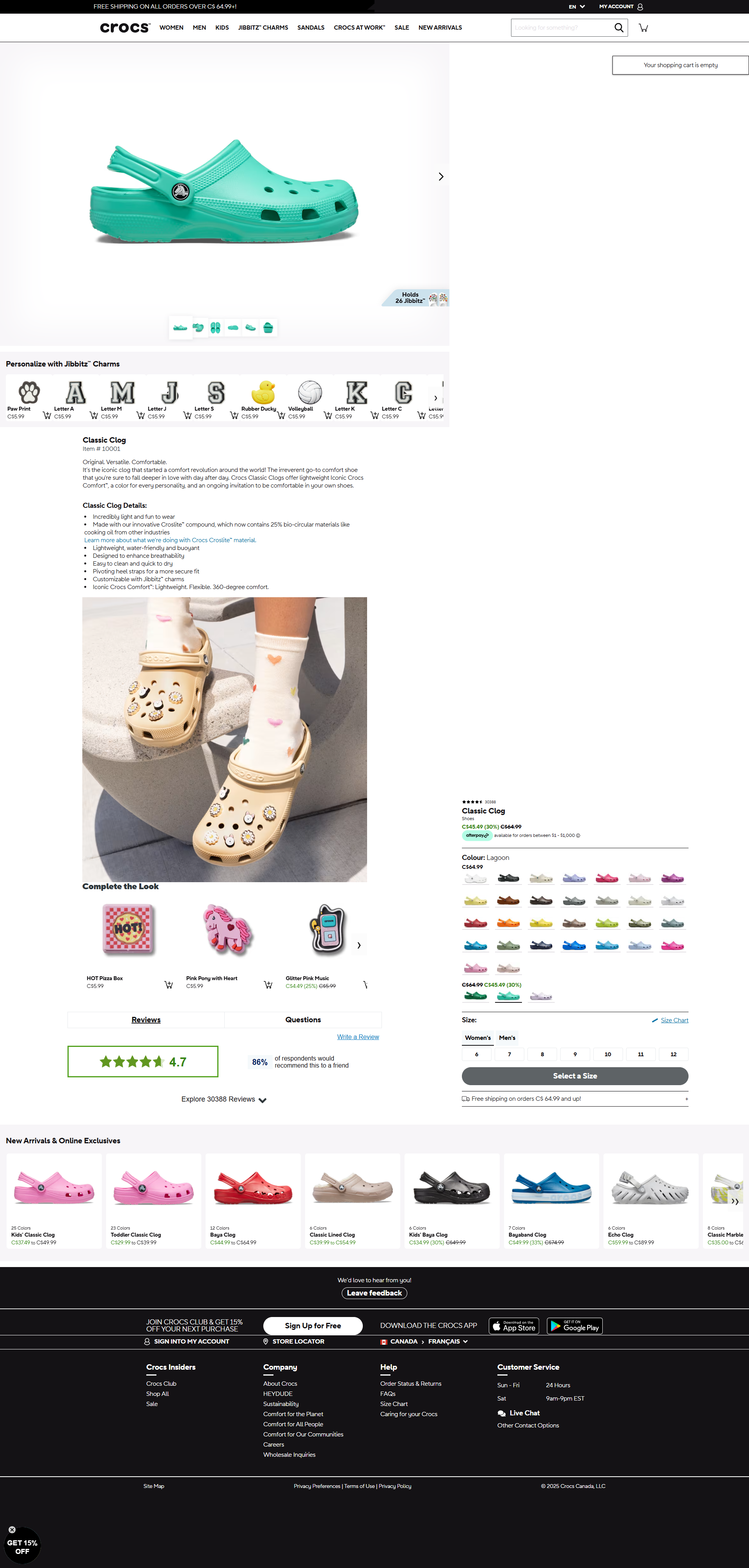
Right under the price, Crocs showed an Afterpay line: pay in installments on orders between C$1 and C$1,000. In the cart, it repeated the pay later option and added a PayPal button.
Why it works: splitting the price makes it feel smaller, and a familiar payment brand makes a new store feel safer. 11 of the 25 top stores we broke down offer pay later, and only 6 show a payment button like PayPal in the cart itself. Our product page optimization guide covers the rest of the buy box.
7. Sell small add-ons that fit the main product
Crocs has a secret weapon: Jibbitz charms. The product page had a “Personalize with Jibbitz Charms” row at C$5.99 each, a “Holds 26 Jibbitz” badge on the photo, and a “Complete the Look” row of charms. The cart suggested more.
Notice the math, too. The Classic Clog was on sale for C$45.49, and free shipping started at C$64.99. That gap is easy to fill with a few charms or a second pair. Whether or not it was planned, the free shipping threshold and the add-ons work as a team.
Why it works: a small add-on that makes the main product better is an easy yes. 22 of the 25 top stores we broke down suggest extra products before checkout, and 19 do it in the cart. If you want to see what a bigger order is worth, read our guide to revenue per visitor.
Cart and checkout: no surprises
The cart is where Crocs closed the loops it opened earlier. Free shipping: confirmed. Pay later and PayPal: right there. A few charms to add. The discount code field was tucked behind a small link, so it didn't send shoppers off to search for coupons.
8. Show shoppers where they are in checkout
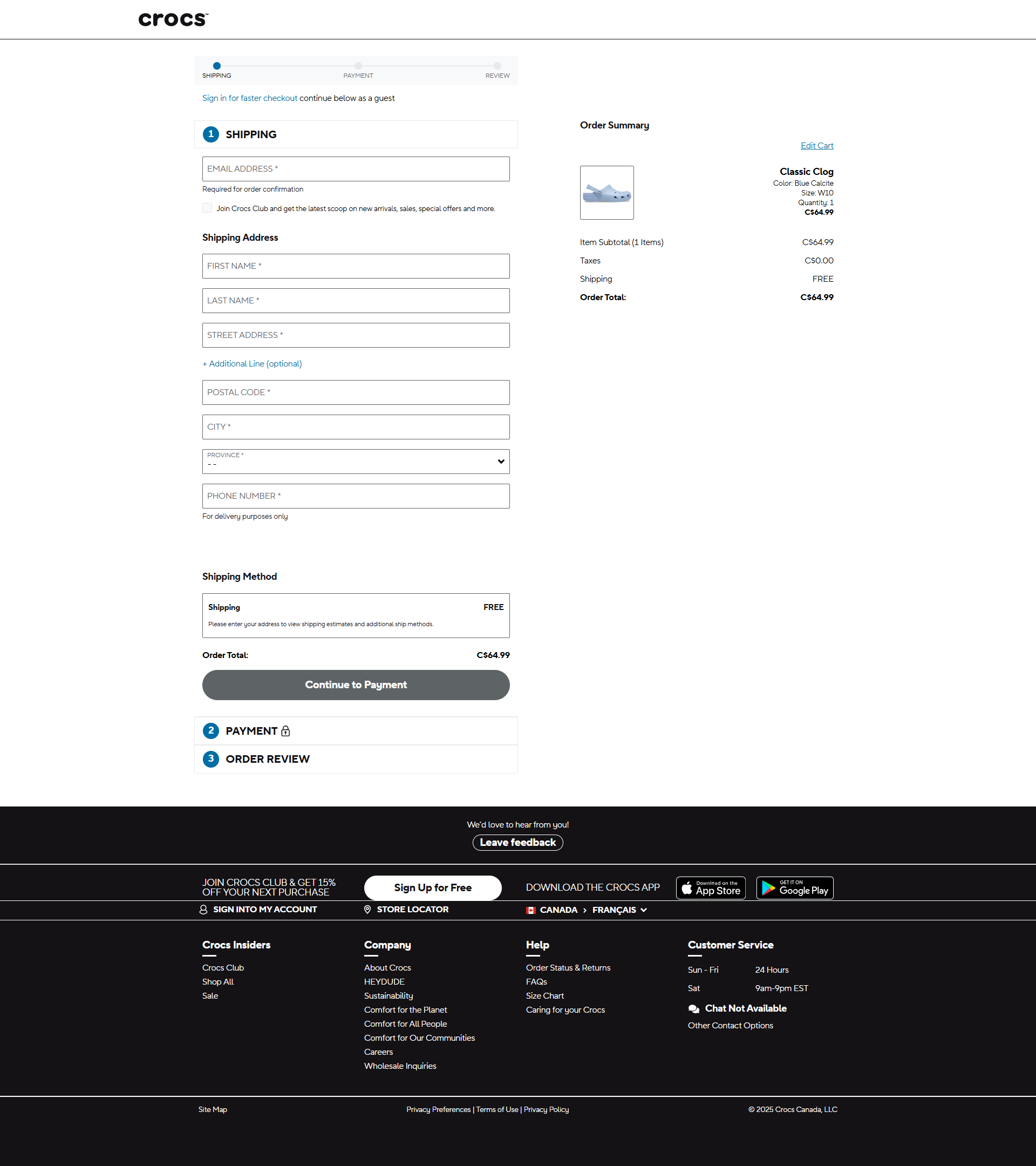
Crocs used a multi-step checkout, with a progress bar on top: Shipping, Payment, Review. It offered a guest option, mentioned the secure process, and confirmed free shipping one last time.
Why it works: a checkout feels long when you don't know how much is left. A progress bar tells shoppers they're almost done. Only 3 of the 25 top stores we broke down show checkout steps like this. On Shopify, checkout is one page by default, so you don't need to copy the steps. Copy the clarity: guest checkout, no surprise costs, and the shipping promise repeated next to the total. Our Shopify checkout optimization guide lists 9 fixes, and adding your own text inside Shopify's checkout steps needs Shopify Plus.
“Crocs doesn't do anything exotic,” says Nicolas Fradet, founder of FunnelSpark. “It does the basics, and it does them on every page. That's the part most stores skip.”
What to copy on your store
You don't need Crocs' budget for any of this. Start with the ones your store is missing:
- Put your shipping offer in a top bar, then confirm it in the cart and at checkout.High impact
- Add photo tiles under your hero so shoppers pick a path in 1 tap.
- Borrow trust: a press logo, a partner brand or a known creator in your niche.
- Show stars and review counts on collection pages, not only on the product page.High impact
- Make real sale prices stand out with a crossed-off price and a color.
- Show pay later under the price and an express payment button in the cart.
- Offer 1 small add-on that makes the main product better, on the product page and in the cart.
- Keep checkout clear: guest checkout, no surprise costs, and your shipping promise next to the total.
Not sure where your store leaks the most? Our ecommerce CRO checklist goes through 40 checks, and if you get traffic but few orders, start with this guide. To see what a small lift is worth in dollars, try our revenue calculator.
FAQ
Crocs builds demand with licensed collabs, celebrity partners and Jibbitz charms that let people personalize their pair. Its online store then turns that interest into orders with a clear free shipping offer, huge review counts, easy navigation, pay later and small add-ons.
Collabs bring in fans of the show, band or team, not only Crocs fans. Limited drops also give people a reason to buy now. On the store, a row of familiar names builds trust and gives each shopper something that feels made for them.
Mostly with small add-ons. Jibbitz charms show up on the product page and in the cart, and the free shipping threshold sat above the sale price of its Classic Clog, so a few charms or a second pair closed the gap.
Not necessarily. Shopify checkout is one page by default, and that's fine. Copy what makes Crocs' checkout feel easy: a guest option, no surprise costs, and the shipping promise repeated near the total. Adding custom text inside Shopify's checkout steps needs Shopify Plus.
Yes. A shipping bar, photo tiles, stars on collection pages, clear sale prices, pay later and a small add-on cost little or nothing to set up. Start with whichever ones your store doesn't have yet.
Written by
Nicolas Fradet
Nicolas is the founder of FunnelSpark, an ecommerce CRO agency. He has spent 16 years finding out why shoppers don't buy, with 1,000+ A/B tests run and a 37% win rate. He wrote Stop Guessing. Start Converting.
Follow Nicolas on LinkedIn →Want us to find what's stopping your shoppers?
On a free 30-minute call, Nicolas looks at your store and shows you 3 growth opportunities, whether we work together or not.
Book your free call